
A color block print does more than fill a wall. It sets the mood of a room—calm, energized, grounded, or playful—without adding visual clutter. Our Vintage Abstract Color Block Canvas Art Print brings that lived-in, mid-century-inspired feel to modern spaces, making it an easy way to refresh a kitchen nook, dining area, entryway, or home office with balanced color and shape. For more guidance, see Color Blocking & Blending: Polly Apfelbaum’s Prints.
Abstract art has a long history of using shape and color to communicate mood and movement (see Encyclopaedia Britannica’s overview of abstract art), and that’s exactly why a well-chosen color block piece can make a room feel “done” without adding more stuff. For further reading, see Ad Reinhardt. Abstract Painting. 1963.
If you’re aiming for a room that feels intentional but not over-styled, color blocking is a practical shortcut: it gives you a ready-made palette. From there, your job is just repeating a couple of tones throughout the room with small, functional items.
Most rooms already have strong “hard” elements—cabinets, appliances, countertops, doors, desks. A warm abstract print helps soften those lines and gives your eye a place to land.
| Room | Best placement | What to pair it with | Avoid |
|---|---|---|---|
| Dining area | Centered on the main wall or above a sideboard | Textured linens, simple ceramics, warm wood | Busy patterns competing at eye level |
| Kitchen/nook | Near seating or on an open wall by a window | Natural fiber placemats, small plant, neutral dishware | Too many small frames scattered nearby |
| Entryway | Above a console or bench, centered | Basket for storage, mirror kept simple, one lamp | Overly ornate frames that fight the geometry |
| Office | Behind the chair or on the wall facing the desk | Muted organizers, one statement pen cup, clean lighting | High-contrast clutter in the same sightline |
Color works best when it’s repeated with intention. Museums often talk about color as a tool for harmony and contrast in composition (the Met’s art history notes on color are a helpful reference), and you can apply the same principle at home: repeat a shade, then give it breathing room.
If your print is going in a dining space or kitchen nook, you can make the whole corner feel coordinated by echoing its structure: clean shapes, warm materials, and a small dose of geometry.
| Room moment | Pick | Why it matches the print |
|---|---|---|
| Weeknight dinner table | Scandinavian Handwoven Leaf Placemat – Eco-Friendly Straw Dining Mat | Natural weave adds warmth and keeps the palette grounded. |
| Weekend brunch | Bohemian Ethnic Cotton Linen Geometric Tablecloth for Dining & Coffee Tables | Geometry echoes the blocky shapes for a coordinated look. |
| Cozy ramen night | Handmade Ceramic Noodle Bowl – Creative Round Ramen Soup Deep Bowl | Rounded ceramic forms soften the graphic edges of the artwork. |
Dining spaces, entryways, kitchen nooks, and home offices are ideal because color blocks set a clear mood and act as a focal point without creating clutter. They help a small area feel intentional with just one strong piece on the wall.
You can treat the artwork like a palette guide: keep repeating one or two colors from the print while swapping out textiles or small decor as seasons change. Texture (linen, wood, matte ceramics) keeps the room layered without locking you into more patterns.
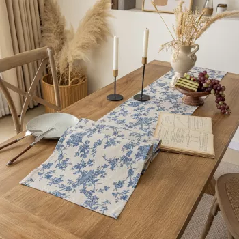
Pull one accent color from the artwork and repeat it subtly—like in a runner, napkins, or a small centerpiece—then keep dishware shapes clean and simple. Natural woven placemats, geometric linens, and rounded ceramics balance the graphic design so your table feels coordinated but still easygoing.









Leave a comment